")


 A few months ago I was holding a pop-up record sale at a local microbrewery. One of the albums I was selling kept causing confusion.
The centre of said confusion was a pretty blue album with absolutely no writing on it whatsoever. Nobody knew what it was.
It was Music From The Edge Of Heaven by Wham! The 1986 album, their farewell record, has cover artwork by Peter Saville Associates, a company responsible for a plethora of ’80s sleeves including Peter Gabriel, Joy Division, Dream Academy, New Order and Depeche Mode.
In thinking about this, I suppose nearly 40 years after its release, the Wham artwork, like most album artwork, was still doing what it was designed to do: Stop record shoppers in their tracks. In this case, because the album was mysterious and warranted closer inspection. That’s sure the effect it was having on the browsers at my popup sale.
I thought this would be a good opportunity to examine some albums which went a similar route in terms of design: Basically without any.
For starters there’s a few in the discography of the aforementioned Peter Saville Associates. Both New Order’s Bizarre Love Triangle and Brotherhood 12″ singles are just plain with little or no writing on the cover.
But it gets even blander. Some albums end up being known not by their names, but by the colour they are. The obvious example here is The Beatles, aka The White Album, perhaps pop’s best early example of minimalist album artwork.
In 1980, The Damned released The Black Album — its actual title. Reissues of the album featured a knockoff of The Beatles. Instead of a plain white jacket with a slightly askew ‘The BEATLES‘ embossed on it, The Damned’s Black Album was pure black, with an embossed ‘The DAMNED‘ on it. I always thought that was pretty clever. Same goes for The Replacements and their 1984 album Let It Be, though this was neither a knock-off or plain cover. I just thought I’d mention it anyway.
There are quite a few “black albums” — Jay-Z put one out in 2003, Metallica in 1991, Prince in 1994 (seven years after it was recorded). The soundtrack for This Is Spinal Tap is also pure black with no writing. “It’s like how much more black could it be?” Nigel Tufnel remarked. “And the answer is — none. None more black.” Kanye West’s 2021 album Donda is pure black. Weezer’s Black Album is almost all black, because the band is nearly obscured by it. Unlike, for example, their “blue album.”
The Beatles isn’t the only white album, BTW — Childish Gambino’s 3.15.20 is pure white with no writing. There are also quite a few album covers which feature just a single colour with no writing, but most aren’t really household names. There are even more with just a single colour and only the title, like Brian Eno’s Music For Films. Suck It And See by Arctic Monkeys is another one of these, like Album by Public Image Ltd.
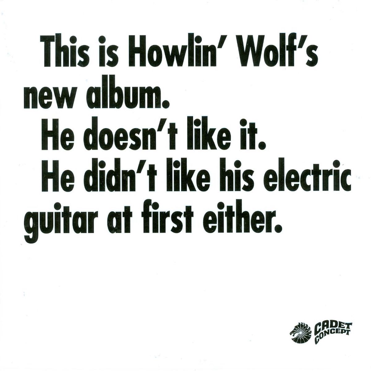
One of my favourite lacklustre album covers is Howlin’ Wolf’s 1969 album, with its stark white cover and just these black-type words filling the space: This is Howlin’ Wolf’s new album. He doesn’t like it. He didn’t like his guitar at first either. People love that cover. It’s readily available on T-shirts, stickers and mugs.
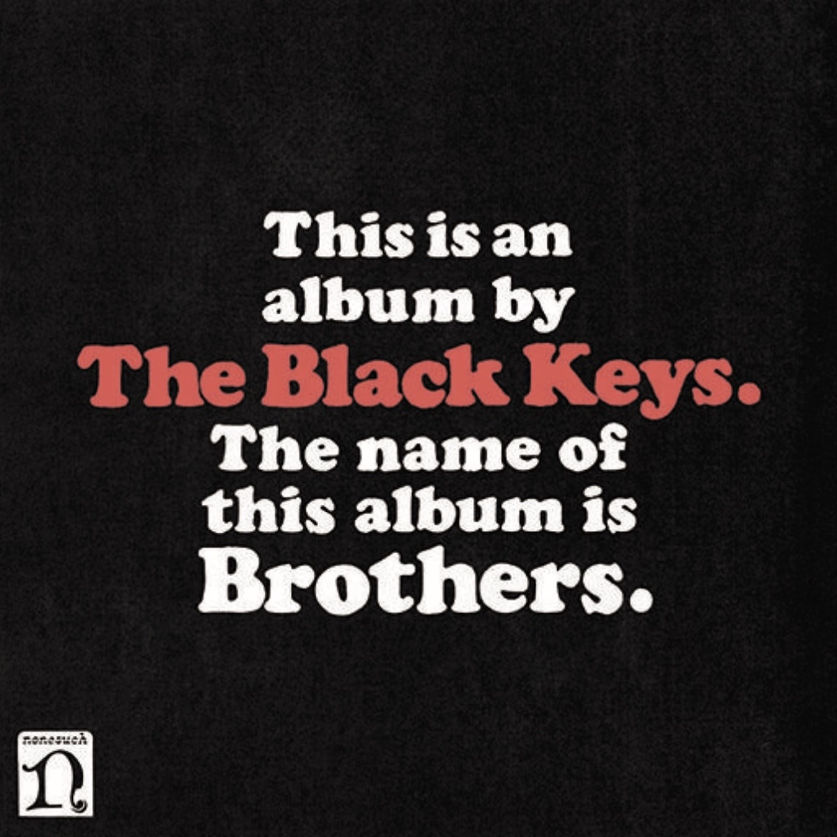
Just as The Beatles’ White Album was copied, so too was this minimalist statement. In 2010 The Black Keys put out Brothers, which features a nearly identical cover, except with white letters on a black background. The cover reads: This is an album by The Black Keys. The name of this album is Brothers.
Howlin’ Wolf probably wouldn’t like that either.
• • •
Area Resident is an Ottawa-based journalist, recording artist, music collector and re-seller. Hear (and buy) his music on Bandcamp, email him HERE, follow him on Instagram and check him out on Discogs.