


")


 Arguably the most famous creator of legendary album cover artwork was the design collective known as Hipgnosis. Begun in the ’60s by Cambridge, U.K. duo Aubrey “Po” Powell and the late Storm Thorgerson, the pair — along with graphic designer George Hardie — created such classic album covers as Houses Of The Holy, Dark Side Of The Moon, Wish You Were Here, The Lamb Lies Down On Broadway, Venus & Mars and the first three Peter Gabriel albums.
In many cases, Storm and Po were commissioned by a band or manager to create artwork to complement the album’s title or concept. Other times, they were tasked with coming up with a concept for the artwork that the band could get behind. But, after the huge success of 1973’s Dark Side Of The Moon and Houses Of The Holy (for which Powell earned Hipgnosis a Grammy nomination — which they lost to the Tommy box set by the London Philharmonic), Hipgnosis were suddenly in a position where they had bands eager to approach them to see what artwork just happened to already be available — like browsing the paint swatches at the home-improvement store.
But here’s the thing — many of these available images and concepts were available because they’d already been rejected by another band. In fact, when Storm and Po would make artwork presentations to groups, they often would have multiple concepts ready and the band would simply pick the one they liked best — or request some variation of it. What this means is, there are a plethora of albums in my collection and yours that were intended for other artists — or, at least they had first crack at them.
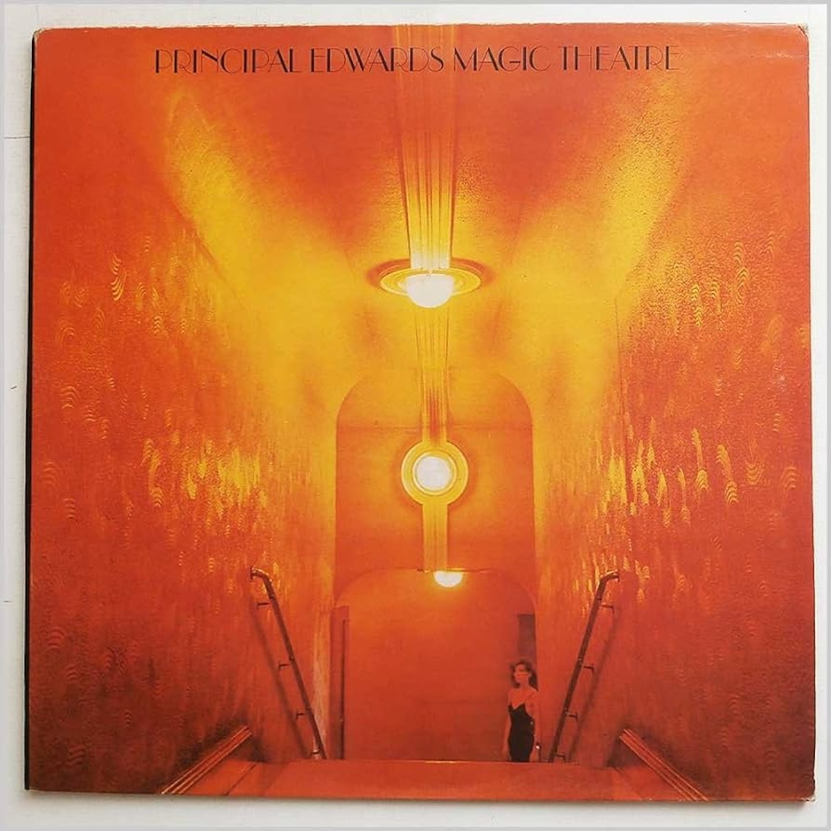
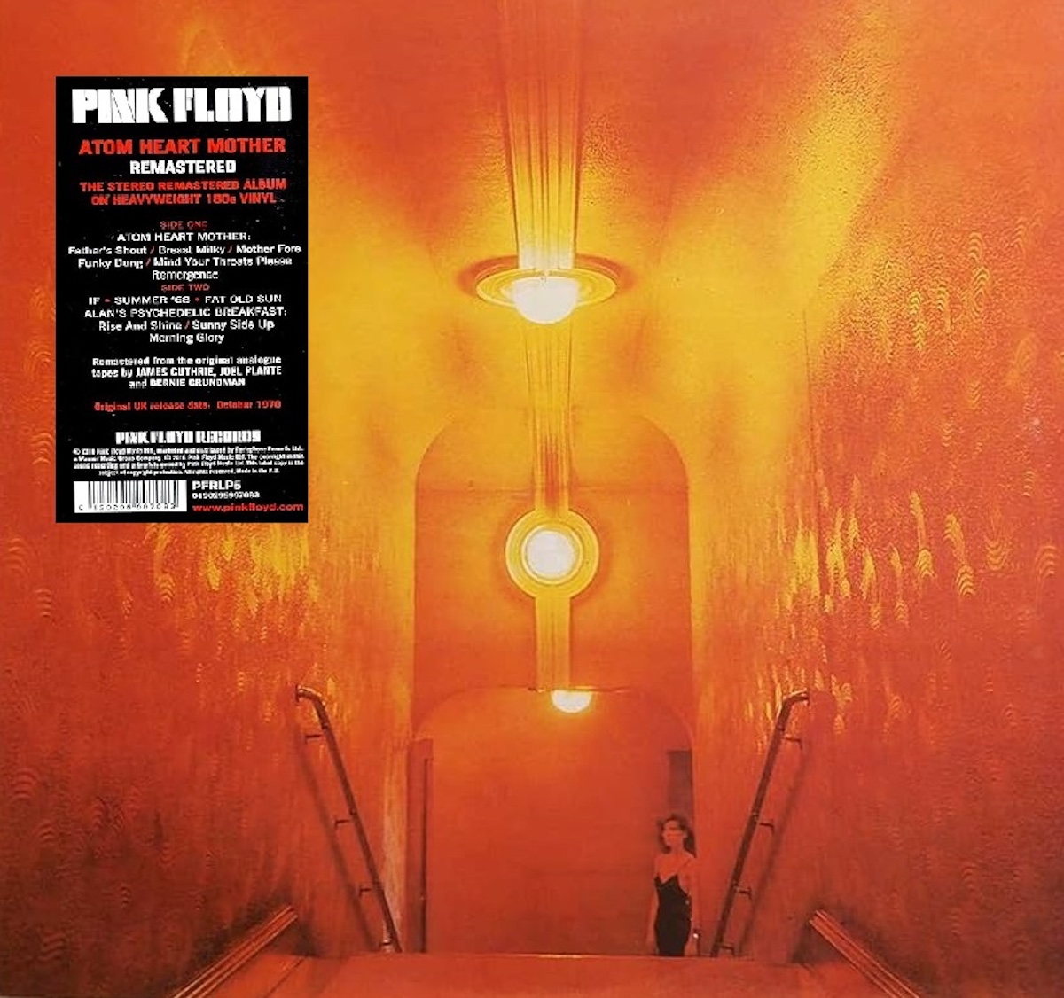
I’ll start with one of Hipgnosis’ more iconic covers — Pink Floyd’s 1970 album, Atom Heart Mother. The classic image of Lulubelle III the cow was definitely part of the formula which led this to become Floyd’s first No. 1 album and first gold record. It ain’t even all that good an album. There were at least two other covers which the band rejected, both of which went on to grace albums by other bands. Principal Edwards Magic Theatre were a U.K. performance arts collective. In 1971, they put out an album — produced by Floyd drummer Nick Mason — called The Asmoto Running Band. It features a woman at the bottom of a gold staircase. This was initially shown to Pink Floyd for consideration as the cover of Atom Heart Mother. So, too was the image of the diver used on the cover of Def Leppard’s 1981 album High ’N’ Dry. I did a couple of mock-ups using the current Atom Heart Mother hype sticker. Suddenly the album doesn’t seem so iconic anymore, eh?
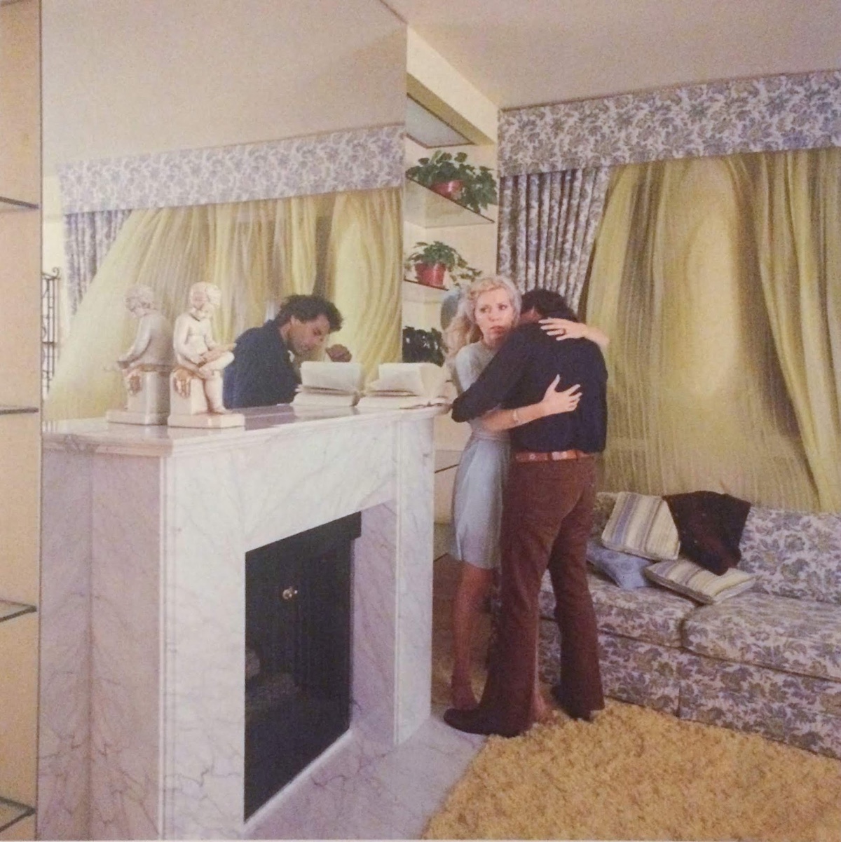
One of the suggested alternate covers for 1975’s Wish You Were Here was included with the Shine On box set. The image shows a couple embracing, but only the man’s reflection shows up in a nearby mirror. The theme of the album was “absence.” Apparently the gatefold cover of Floyd’s 1973 compilation A Nice Pair is largely made up of a grid of rejected album cover images, though some were obviously shot specifically for the two-record set and most have a pun theme.
Another rejected Pink Floyd cover — though I’m not sure for what album — ended up as the cover of XTC’s sophomore album Go2 in 1978. When guitarist/vocalist/songwriter Andy Partridge went to browse the images Hipgnosis was pitching to the band, he didn’t like any of them. But, he spotted a mock-up of what would become Go2 and was immediately smitten.
Maybe that Go2 cover was one of the six rejected covers Hipgnosis apparently pitched for Dark Side Of The Moon. The only detail I can find about any of them was that one involved a character similar to The Silver Surfer. The Dark Side Of The Moon cover actually happened due to the nature of a comment by keyboardist Rick Wright. He didn’t want another obscure image and made an off-hand suggestion of a box of chocolates. This immediately got Thorgerson thinking about Pot Of Gold… rainbows… prisms. He and Powell gave the band a mockup sketch of their idea, which they loved. They hired Hardie to make it, and the rest is history.
Another Hipgnosis album cover originally intended for a different band is the one on 10cc’s 1978 album Bloody Tourists. Hardie was again brought in to add graphics to a Powell photograph of a map being blown into someone’s face. This image was initially presented to Genesis, who rejected it. I’m guessing this was intended for Wind And Wuthering. Makes sense. In this case, however, I prefer the rejected image to the stark, bland one the band ultimately chose — also via Hipgnosis, but primarily a watercolour painting by Colin Elgie.
And then there’s a whole slew of album cover images which were rejected, and seemingly never used by anyone else.
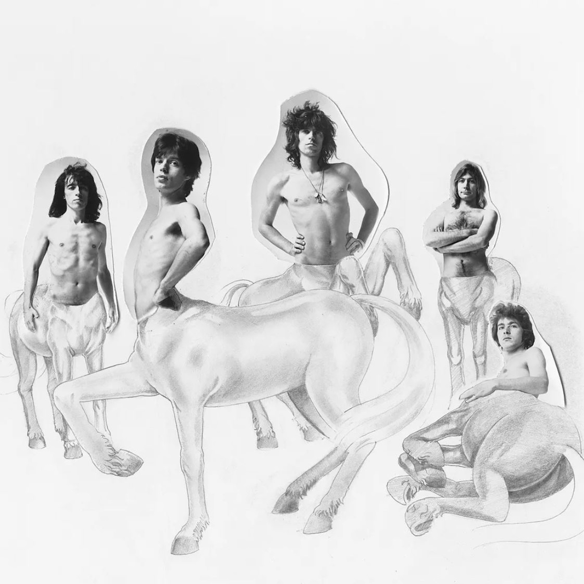
The Rolling Stones were game for a Hipgnosis photo shoot for the packaging of 1973’s Goat’s Head Soup. The concept pitched to the band was having their torsos added to the bodies of goats or horses, like centaurs. This seems a bit stupid, to me — but then again, they were bugs on Metamorphosis (1975) and blooms on Flowers (1967).
I’m not at all surprised that Paul McCartney rejected the proposed cover for his 1982 album Tug Of War — it was a shot of a shirtless young man, seen from behind, with a noose around his neck. The image and concept were created by Peter Christopherson, one of the Hipgnosis partners. “Peter had a habit of surprising Storm and me with his particular outlook on life,” remembered Powell.
Christopherson was known by the nickname Sleazy, and was also the founder of both Throbbing Gristle and Psychic TV. Among the album designs he contributed to are Pink Floyd’s A Nice Pair, Wish You Were Here, Animals and Gabriel’s first three solo albums. Perhaps he knew the renowned conservative McCartney would reject the image — he had a reputation for commissioning Hipgnosis even though he already had a concept in mind, as was the case with Venus And Mars. Oh, and there’s also the fact that Paul’s wife Linda was a professional photographer.
While Zep’s Houses Of The Holy ended up earning Hipgnosis one of their five Grammy nominations for album packaging (they never won, somehow), the famous Powell gatefold sleeve photo of white-clad children climbing the rocks at Giant’s Causeway in Northern Ireland was not their first pitch. Powell’s partner Thorgerson first suggested a photo of an electric green tennis court, which he unveiled to an unimpressed Jimmy Page, who took offence to the insinuation that their music was “a racket.”
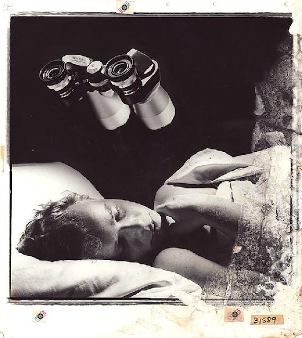
The album which eventually became known as Foreigner 4, in 1981, was originally to be called Silent Partners. It was for this title that Hipgnosis designed a cover, rejected for being “too gay.” It was of a young man sleeping in bed, with a pair of binoculars suspended in the air above him.
A year later, they were asked to come up with a cover for Scorpions’ 1982 album Blackout. Their design of smashed glass held in a freeze frame by hanging the shards from visible threads, was rejected in favour of what became arguably their most well-known cover — one of the many masochistic self-portraits of artist Gottfried Helnwein. This one shows the subject bound, screaming with dessert forks pushed into his eyes.

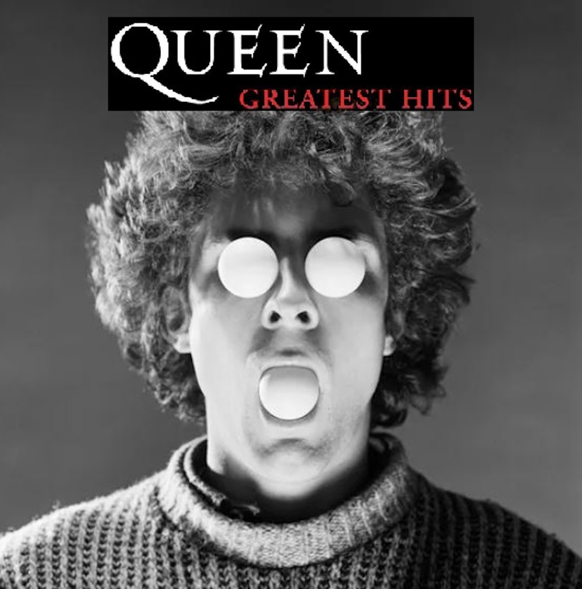
For a groundbreaking band, Queen sure had a slew of rather boring album covers. A Night At The Opera and A Day At The Races are basically identical, just one white and the other black. Queen II has an iconic photo and both News Of The World and Jazz are interesting — but The Game and The Works are just band photos. Sheer Heart Attack is too, but at least it’s a sexy Mick Rock photo. So Hipgnosis were given an opportunity to pitch something for the band’s 1980 Greatest Hits album. They came up with an image of a man with tennis balls in his mouth and eye sockets. Get it? Hits? Tennis balls? It was rejected for yet another band photo. I did a mockup for you.
Years later, after the dissolution of Hipgnosis as art agency, Thorgerson was asked to design Red Hot Chili Peppers’ Stadium Arcadium cover. He came up with three options, all of which were rejected in favour of a much simpler concept involving yellow superhero lettering and planets. The outspoken Thorgerson publicly denounced the final product.

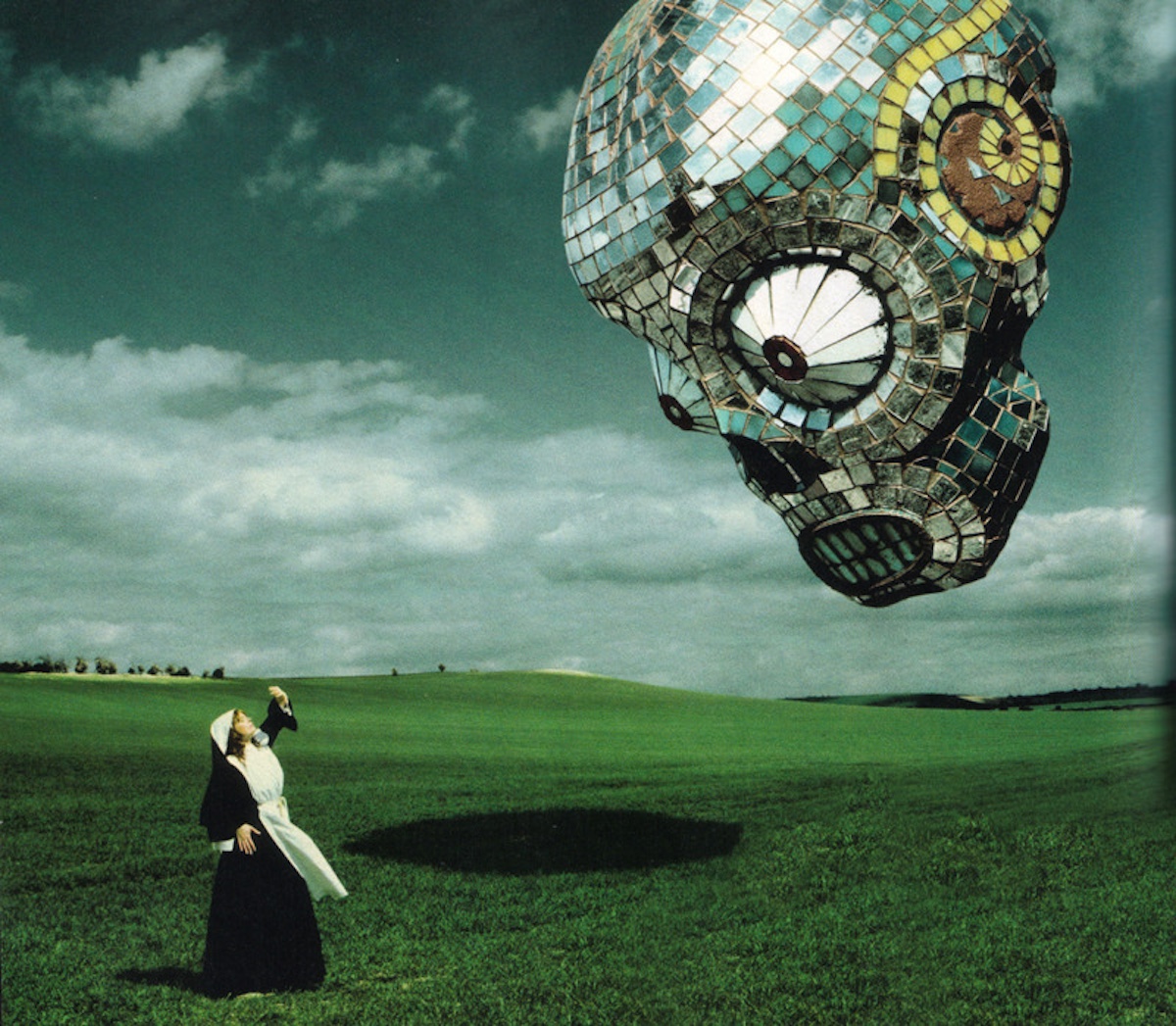
The Mars Volta also passed on Thorgerson’s proposed artwork for Amputechture in 2006 after doing the artwork for both De-Loused In The Comatorium (2003) and Frances The Mute (2005). I don’t know about this one — pretty sure I wouldn’t have rejected the striking image of a floating, huge, Day Of The Dead-style skull made up of mirrors like a disco ball and appearing in the sky above a startled woman.
Can I have it?
• • •
Area Resident is an Ottawa-based journalist, recording artist, music collector and re-seller. Hear (and buy) his music on Bandcamp, email him HERE, follow him on Instagram and check him out on Discogs.


")


")